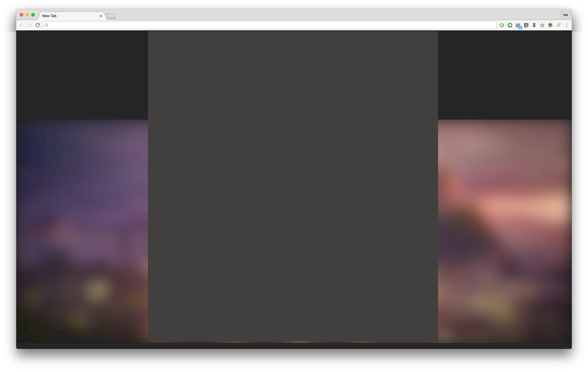
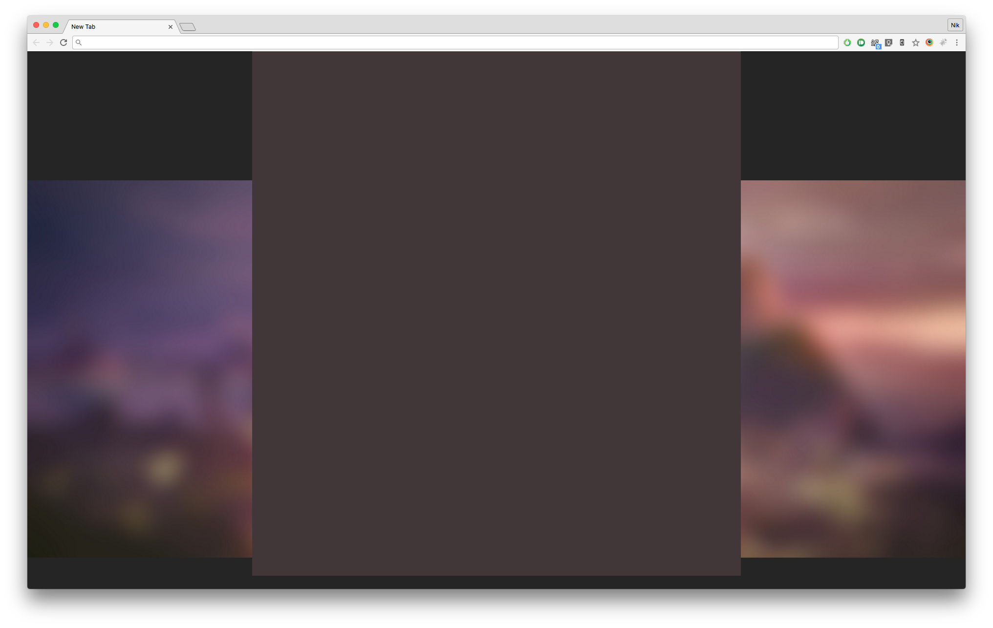
This week we spent spiking a new feature! Always very exciting. Would love to tell you what it is, but this is not the time nor the place. If you want to know, apparently I get more talkative after a beer.
Anyway, for this feature our UX people really wanted to blur images, because that’s up and coming these days. Now that doesn’t exactly sound like a challenge, what was CSS3 invented for anyway? Well, sadly we still have to give some consideration Browsers from the pre-CSS3 era, and whilst the funky old Microsoft DXImageTransform filters do have a nice blur, it’s not really a route we wanted to settle on (and also would only be supported in IE 5.5-8 and 10+ I believe, because who likes logic anyway)
So we looked at alternatives. Client side we looked at drawing in a HTML canvas and putting our image inside of an SVG with a filter on. The drawback of the HTML canvas is that there’s no simple way to blur without much code - we’d have to package our own blur algorithm (this one seems to pretty popular, coming in at 6kB minified), we don’t really want to do that for reasons.
So SVG blur is the other client-side solution, which is also used by other teams within the organisation, but they have quite a different set of requirements. And it’s pretty simple, look at that:
<svg>
  <defs>
    <filter id="svgBlur">
      <feGaussianBlur in="SourceGraphic" stdDeviation="25"/>
    </filter>
  </defs>
  <image xlink:href="http://7nr.de/somepicjpg" width="100%" height="100%" filter="url(#svgBlur)" />
</svg>
Pretty straight forward, hm? It also looks beautiful, in Safari at least. Very different situation in Chrome or Firefox, however:
- There is some serious banding on the graphic. No idea where it comes from or why, but it just looks a bit ugly.
- Due to the nature of the Gaussian Blurs and SVGs, the edges of the image get blurred with the surroundings, in this case nothing - i.e. it just fades out and becomes semi-transparent towards the edges. This is something that can probably be fixed easily by setting the width/height of the filter, or just zooming in the image or.. there are probably a couple other methods.
- There was a third point, but I don’t remember it now.
This made us think about alternatives, and our infrastructure - and our infrastructure is quite clever! For any raw source image our image server can generate different resolutions, and caches them and whatnot. Not only can you specify a resolution, but these ‘recipes’ that we use can contain a whole range of commands to be applied (it uses GraphicsMagick under the hood).
One of those commands is ‘blur’, and it looks beautiful. And because there’s no client-side operation, it’s supported in any browser that can display JPEGs - which is definitely a superset of the browsers we care about so yay :)
To just illustrate the differences between a GraphicsMagick blur and an SVG blur in our case and in this case in my specific configuration on my machine, here two screenshots (you might want to open them in a new tab/view them full sized):
SVG Gaussian Blur:

GraphicsMagick Blur:

N